

Complete Guide to Petz Image Editing ~ Photoshop
Jan 17, 2008 2:55:25 GMT -5
Batspam and Cherry-Spot like this
Post by Solloby on Jan 17, 2008 2:55:25 GMT -5
Complete Guide to Petz Editing ~ Photoshop
By Solloby
By Solloby
Programs & Notes
Here is a complete guide that covers a lot of different Petz editing. As with most of my guides, it got very large very fast. Oops.
I am currently using Adobe Photoshop CS3, but have previously used Photoshop 7.0 and for the purposes of Petz editing, there are no significant differences.
You can use other graphic editors, you may just need to hunt around for the tools, and the shortcut keys will probably be different.
You will need:
- Adobe Photoshop (Any version should work) or another quality graphics editor
- Petz Images
Petz are Pixels
Petz images are raster/bitmap images. This means that they are made up of pixels - small square dots. If you resize the image (make smaller or larger), it will decrease the quality and blur the image. This will also happen if you save the image as a .jpg and allow it to compress the image by replacing the colours. This is why .gif is a good choice. .png files are larger, but good if you want to retain the quality of your backgrounds.
Unless you know what you are doing:
- DON'T resize Petz images
- ONLY save Petz images as .gif or .png
Contents
1. Transparent Backgrounds
2. Outlines
3. Background Basics
4. Adjustments
5. Eye Shines
6. Shading
7. Smudgies
1: Transparent Backgrounds
Here is an easy way to get a Transparent Background. Removing the white background also makes editing the pet easier if you want to use it for an avatar or signature or just to add a nifty background.
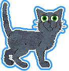
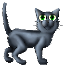
First let's prepare our image for editing. I'm going to use Global's show pose as an example. Here's what I started with:

Now with .gif images, Photoshop locks the layer, so we're going to copy-paste the image into a new file.
1. Open the Petz image in Photoshop.
2. Press Ctrl-A to select the entire image, then Ctrl-C to copy it.
3. Press Ctrl-N to create a new file, then press enter (don't touch the size).
4. Press Ctrl-V to paste your pet into the new file.
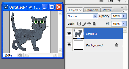
Have a look at layers. Your pet is on Layer 1, and there is a white background that is locked.
5. Close the original image, we no longer need it.
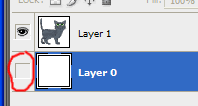
6. Double-click the background layer and press enter to unlock it. It will rename itself to Layer 0.
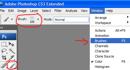
7. Make Layer 0 invisible for now (although you won't see a different yet). You can do this by clicking the little eye beside the layer so it disappears, as shown below (circled red):
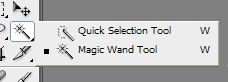
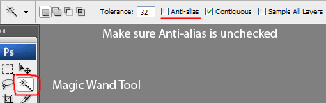
8. Click on Layer 1 to select it. Select the Magic Wand Tool on the toolbar on the side or press W. Make sure you have the Magic Wand and not Quick Selection. If you don't, click the tool but hold down your mouse button until the following comes up, and click the Magic Wand Tool.
9. Go to the top toolbar and make sure that you have Anti-aliased unchecked - this is very important for Petz editing.
10. With the Magic Wand Tool still selected, click the white around your pet. If you had the Contiguous unchecked then all pure white in the image will be selected. If you had it checked like I did, then you need to hold down the shift key and click any white that wasn't selected (such as between Global's back legs) to add it to the current selection.
11. Press delete to get rid of the white background.
12. Press Ctrl-D to deselect the background.
Now let's save our transparent image:
1. Go to File > Save For Web or Saved Optimised As depending on what version of Photoshop you are using. Or just hold down Ctrl-Shift-Alt-S.
2. Make sure you save the image as in gif format, and with transparency but no transparency dither.
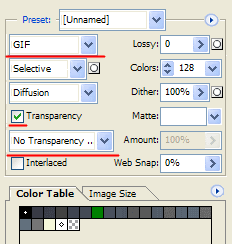
3. Press enter. And that's it!
2: Outlines
There's a great tutorial on adding a solid outline here: Outline Tutorial
Here is how to make different outlines.
Part A: Changing the Colour & Gradient Outlines
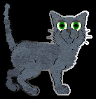
I've gone ahead and added a green outline to Global. Hmm, I don't think I like it much. Let's change it.

See that white dot? We'll fix that by deleting it with the magic wand tool. Ok, I've decided I want a white outline. That won't be easy to see without a background though.
1. Make the background layer (Layer 0) visible again by clicking where the eye was. If you are going to use a dark outline, leave it white, but if you are going to work with a white outline, select the layer and press Ctrl-I to invert the colour and make it black. This is just to help us see what we are doing.
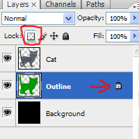
2. Double-click on the outline layer's name to rename it, and type in Outline (we have 3 layers and will be making more, so this will be helpful later). Go ahead and rename the other layers if you like, but go back to the Outline Layer once you've done that.
3. Lock the layer's transparency by clicking the button circled in red below. This will add a little lock to your layer.
4. Now pick the colour you want. I'm going to press D to return my colour palette to black/white, then X to toggle them so white is selected. I could've just clicked on the block of colour and selected it though.
5. Make sure you're still on the Outline layer. Now either use the paint bucket tool to fill the outline with colour, or press Alt-D to fill it. Only the outline will fill as we've locked the transparency.
Pretty nifty, huh? What's that, you want a gradient outline? Easy!
1. Select the gradient tool. This is with the paint bucket, just hold down your mouse button on the paint bucket until a little side toolbar pops up and select the gradient tool if it's not already visible. G is the shortcut key to select it instantly.
2. I'm going to leave the default black-white linear gradient, but you can play around with the setting up the top if you like.
3. Drag the gradient tool over the Outline layer. As the transparency is locked, it will only affect the outline. Play around until you get something you like. Hold down Shift to keep it straight if you like.
Here's what I got:
I think I liked plain white better though.
Part B: Double Outlines
These are super-easy to do.
1. Double-click your Outline layer (not on the text though, this will prompt you to rename the layer), or right-click it and select Blending Options.
2. Click Stroke at the bottom. It will automatically become checked, and let you adjust the options. Click the coloured box beside the word Colour and change the colour. You can play with the other options too if you like.
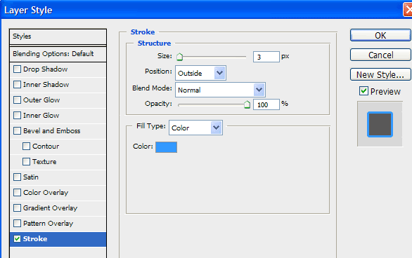
3. Click ok. That's it!
3: Background Basics
Make a new layer underneath the cat (and outline if you have one) layer(s). Make the background on this layer. You might like to use multiple layers.
Part A: Soft Abstract Backgrounds
To make soft, abstract backgrounds, experiment with different soft brushes and textures.
Here are some things you might like to play with:
- Soft Brushes
- Brush Settings (try playing with scatter)
In Photoshop 7, Brushes are also found at the top right rather than having to go through Window to bring up a pop-up menu.
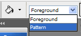
- Textures (Select the Paint Bucket then set it to Pattern)
Try adjusting the colour of textures. See section 4.
Here are some examples of soft backgrounds I've made:
Petz are owned by Marijean & Lucid respectively.
Part B: Pixel Backgrounds
Petz are Pixels, so why not make a pixel background? You could do stripes or draw a picture. Here's how to set your brush to work with pixels:
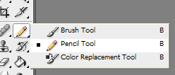
1. Hold your mouse button down on the brush until you get the little menu and select pencil.
That's it. Yup, 1 step.
If you want to make stripes, hold down the shift key when drawing a line to keep it straight. This works horizontally and vertically (but not at the same time) if you have already started drawing. To make diagonal lines, just use Ctrl-T to Free Transform a horizontal/vertical, and swivel your line until you're happy. Otherwise, you can draw one pixel and hold down shift, then let go of the mouse button. Still holding shift, click somewhere else and Photoshop will connect the line.
To make multiple lines, an easy way to make parallel lines is to duplicate the layer and then shift the line around with the Move Tool (the pointer/black arrow). Shortcut to select the Move Tool is V.
4: Adjustments
Image > Adjustments > Hue/Saturation: (or Ctrl-U)
This allows you to adjust:
Hue - the colour
Saturation - amount of colour (no saturation is grey)
Lightness - left end of the scale is black, right is white
Related:
Using Ctrl-Shift-U desaturates an image (converts to greys).
Image > Adjustments > Brightness/Contrast:
Brightness is like Lightness, but a little different.
Contrast makes the bright parts brighter, and darker parts darker.
Resize the Canvas
Not enough room to draw a pretty background? Just go to Image > Canvas size and enter bigger numbers. You can also make it smaller by entering smaller numbers.
5: Eye Shading
Here's a good tutorial for eye shading: Eye Shading Tutorial
I shade eyes a bit differently, so here's how I do it. You might like to zoom in for this.
1. Grab the pencil tool and make sure you are using size 1, and white for the colour. Put a nice 1 pixel 1 dot on the black pupil. You might like to zoom in for this.

You can leave it there, or do some nifty dodge/burn shading.
2. Use the Magic Wand tool to click on the coloured part of each eye. Leave this selected so you can dodge and burn without affecting the eyelids or rest of the cat.
3. Grab the burn tool and set the Range to midtones (see Section 6 if you are having trouble locating the dodge or burn tools).
Burn the top of the eye.
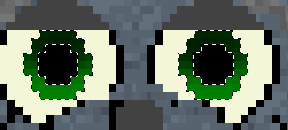
The dotted lines are from the magic wand tool.
4. Grab the dodge tool and set it to highlights. Dodge the bottom of the eye on the right hand side.
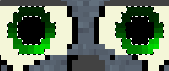
5. Press Ctrl-D to deselect the eyes and zoom out, back to 100%.
This is what I have (I forgot to add the 1 dot to the black of the eyes before I dodged and burned, so I added it after).

6: Shading
Shading consists of 2 parts: Highlights, and Shadows. There are many, many different ways to shade. You can use layers above the pet set to overlay, lighten or multiply, and colour on them using greys, or you could just use the dodge/burn tools.
If you go with the latter, it means working on the same layer as the pet, duplicate the layer and hide it to save a backup, so if you make a mistake and can't undo far enough (look in the history toolbar on the right above the layers as Ctrl-Z just toggles the last action in Photoshop), you can just reshade the duplicate layer.
Part A: Light Source
The first thing you need to think about is the light source. The default is above and to the left of the pet, but you can put it above and to the right or elsewhere.
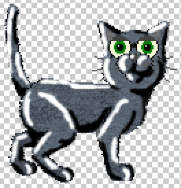
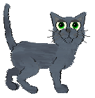
Here's Global, with white where the highlights might be, and black where shadows might be. As you can see I've used the shading to show the shape of his forearm and his knee. The light source is just above him and to the left a bit. It doesn't have to be 100% perfect, with white over ever left line and black over every right one.
Shading Methods
Now you must choose your shading method. Part B covers Overlay Shading, which is slightly more involved but gives you more control over your shading. Part C covers Dodge/Burn Shading. Both result in basically the same image if you shade the same areas.
Part B: Overlay Shading
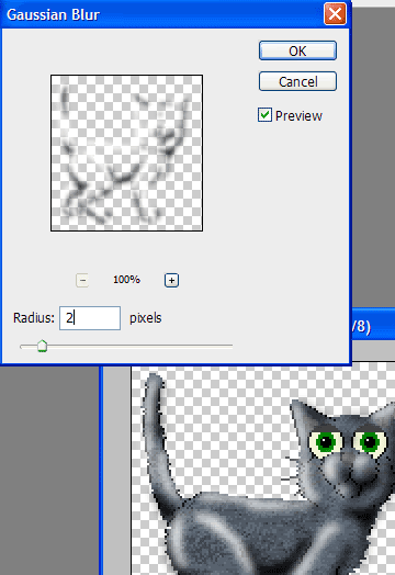
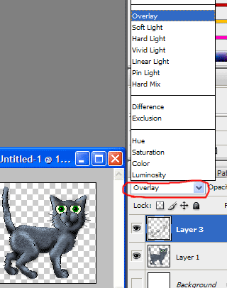
1. Use black and white to show the highlights and shadows as shown in Global's image above. You can do it on the same layer. Go to Filter > Blur > Gaussian Blur. I chose to use 2, but you can make it more or less if you wish. I've zoomed in on Global to 200% to make it easier to see.
2. Change the layer type to Overlay by selecting the layer and clicking the word Normal to bring down a drop-down (or drop-up) menu, and selecting Overlay.
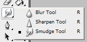
3. Touch up the shading using the smudge tool. Zoom in on your pet and grab the smudge tool. Use the smudge tool to move around the shading until you are happy. You can also use the brush tool to draw on more highlights/shadings then blur them with the smudge tool.
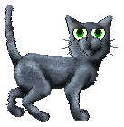
Here's what I ended up with. I touched it up then added some shading to the eyelids and eyes.
Part C: Dodge/Burn Shading
1. Back-up your layer by duplicating and hiding the duplicate.
2. Grab the Burn tool.
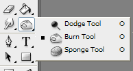
Up the top, set the Range to Midtones (you can experiment with Shadows and Highlights though if you like). Use the burn tool to make the shadows.
3. Grab the Dodge tool. Up the top, set the Range to Highlights or Midtones, just experiment to see what looks best for your pet's coat colour. Use the dodge tool to make the shadows.
You might like to play around with the Exposure % as well. It's beside the range. Less exposure means less effect, so if the dodge tool is highlighting too much, just lower the exposure.
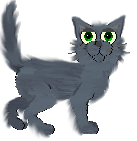
Here's what I got:

It's pretty much the same as the Overlay shaded Global, although I chose to shade slightly different areas this time, and because of the exposure and lack of gaussian blurring/smudging, it came out brighter. I also used a bigger brush so covered more of the cat.
7: Smudgies
Part A: Smoothies
1. Shade your pet. Aim for something like my Dodge/Burn shaded Global.
2. Grab the smudge tool with a good-sized brush setting (try size 9)
3. Smudge inside the lines and gently blend the colours together. Try hard not to go over the black outlines of the pet. Be careful not to smudge the face too much, you want the features to still show.
This is what I got:
Notice the black pixels naturally around the cat are still visible.
Part B: Smudgies
1. Start with your pet's image opened, but not shaded.
2. Grab the smudge tool and choose a small brush size (try size 5).
3. Smudge inside the lines doing 1 stroke at a time. Whilst with the Smoothie I ran the smudge brush back and forth, with Smudgies just do each individual stroke one after the other. The idea is not to blend the colours too much. Always smudge in the direction of the fur. Be very careful around the face. You may like to not go over the black outlines of the pet so it still has form, but others prefer to smudge over them to make it more fluffy.
Here are both versions, they are my first attempts at Smudgies so not perfect, but nonetheless.
You can then shade your smudgie if you like.


![[crazy]](http://storage2.proboards.com/216663/images/sqwDNEIwfT0TqkYjYzUf.gif) fixed a whole bunch of little issues in both my games. I feel behind the times
fixed a whole bunch of little issues in both my games. I feel behind the times