|
|
Post by Jess @ PRU on Jul 6, 2013 0:14:11 GMT -5
I'm fiddling around with PRU's new layout.. I decided the first one is too much of an eye-sore (even though I do like it, I just can't stare at those colors for very long), and the black one might be boring but I kinda like it anyhow? Any suggestions/critique/advice is greatly appreciated! I usually have a bit of difficulties with my layouts x3 Option1: 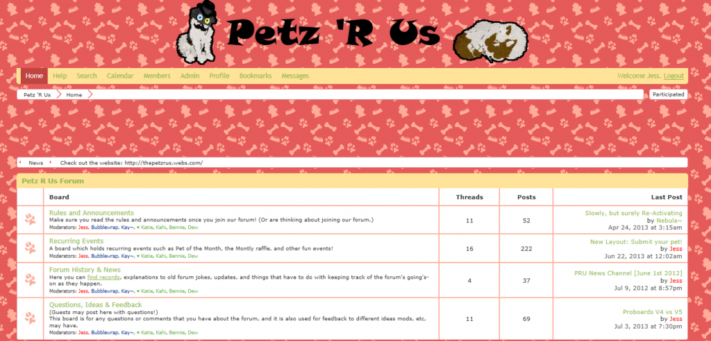 Option 2: 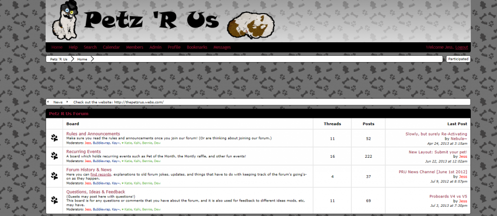 (edit)Option 3: 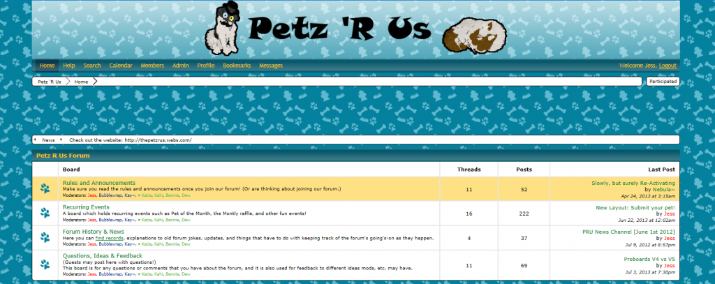 |
|
|
|
Post by Newlndnfire on Jul 6, 2013 0:22:08 GMT -5
I really like option 2 and 3! The blue is a bit brighter but the black looks very nice too! I like how in option 2 the name is towards the left rather than the center, I have no idea why but I like it like that haha. Overall I would probably go with option 2.  But all of them look very nice. XD |
|
|
|
Post by Jess @ PRU on Jul 6, 2013 0:25:05 GMT -5
yeah, so far that seems to be my favorite, and easiest on the eyes, too. Thanks for the feedback!
I'm not sure if there is anything I can change in the first layout. Even something small. That might make it more eye-friendly? Idk. Maybe not x3
|
|
|
|
Post by Newlndnfire on Jul 6, 2013 0:28:22 GMT -5
Well, and i'm not even sure if you CAN do this, but perhaps change the paw print colors from black to another color on option 2? That would add a bit of eye pleasing color without being too overpowering. Just an idea.  |
|
|
|
Post by Jess @ PRU on Jul 6, 2013 0:37:18 GMT -5
I could try that and see how it goes It mighhhht make it look a little bit busy, but it's worth a try to see how it turns out |
|
|
|
Post by Newlndnfire on Jul 6, 2013 0:43:58 GMT -5
I'd love to see if it turns out nicely. But really, I think it looks quite nice as is. |
|
|
|
Post by Jess @ PRU on Jul 6, 2013 0:48:07 GMT -5
I change the grey color too because I wasn't sure that it would look right otherwise. I changed it to a maroon color to match the red of the links. I actually really like it but haven't decided if I like it better than the black or not, though I think I might. It's different  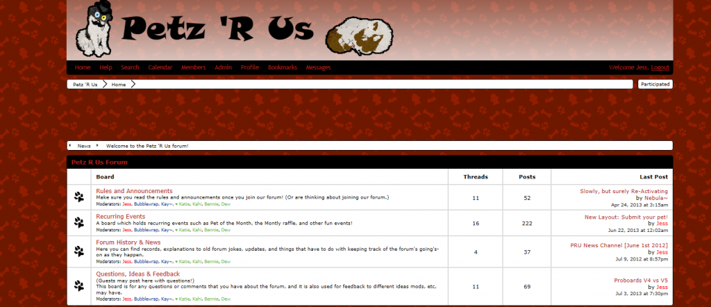 2nd optinions are definitely welcome though! hah |
|
|
|
Post by Newlndnfire on Jul 6, 2013 1:27:52 GMT -5
Ooh, I would definitely go with that one. It looks very nice with the red! Not too bright either. What I actually meant was the paw prints beside each of the separate boards and not the ones in the background though just to clarify haha. |
|
|
|
Post by Jess @ PRU on Jul 6, 2013 1:43:19 GMT -5
oh! gotcha! yeah, the pawprints next to each board I use for the new/old threads. So they change to maroon when there is a new topic, and are otherwise black And thanks! |
|
|
|
Post by Newlndnfire on Jul 6, 2013 1:49:41 GMT -5
Oh haha, I see, it sounds great though. And no problem. |
|
|
|
Post by nostalgia on Jul 6, 2013 15:24:12 GMT -5
I personally really love the blue one, option 3; I honestly don't really like the black or red ones.. they aren't very inviting, and seem a bit bland to me. :/
The blue one has just enough color to make it pop, but it isn't too harsh on the eyes. The color is just really nice in general, as well! If I were you, I would definitely choose that one, but that's just my personal opinion.
|
|
|
|
Post by Jess @ PRU on Jul 6, 2013 19:13:59 GMT -5
So far I think I like the red one - however, I'm going to leave some of these options available if people want to change which layout they want to use in their profile (: I might play with the blue one a little bit before I decide which one stays as the default one |
|


 But all of them look very nice. XD


 If so, I apologize. Hello all, my comp got seriously oofed, and I just got it back with a clean bill of health!
![[crazy]](http://storage2.proboards.com/216663/images/sqwDNEIwfT0TqkYjYzUf.gif) fixed a whole bunch of little issues in both my games. I feel behind the times
fixed a whole bunch of little issues in both my games. I feel behind the times